Copyright © 2026 D. Parkyn Jackson. Published by the Yogi Publication Society History Project. All rights reserved.
For more than a century, the Yogi Publication Society‘s distinctive emblem has appeared on some of the most influential books on Eastern philosophy, Hermeticism, and New Thought. Yet despite its familiarity, few know its deeper sacred geometry meaning or its purpose to communicate the philosophical ideals that lie behind the Society. This article examines the logo’s evolution and its hidden meaning, comparing it with Hindu, Hermetic, Rosicrucian, Masonic, and Theosophical traditions to show the intention behind the network that produced the YPS titles.
The Birth of the Symbol
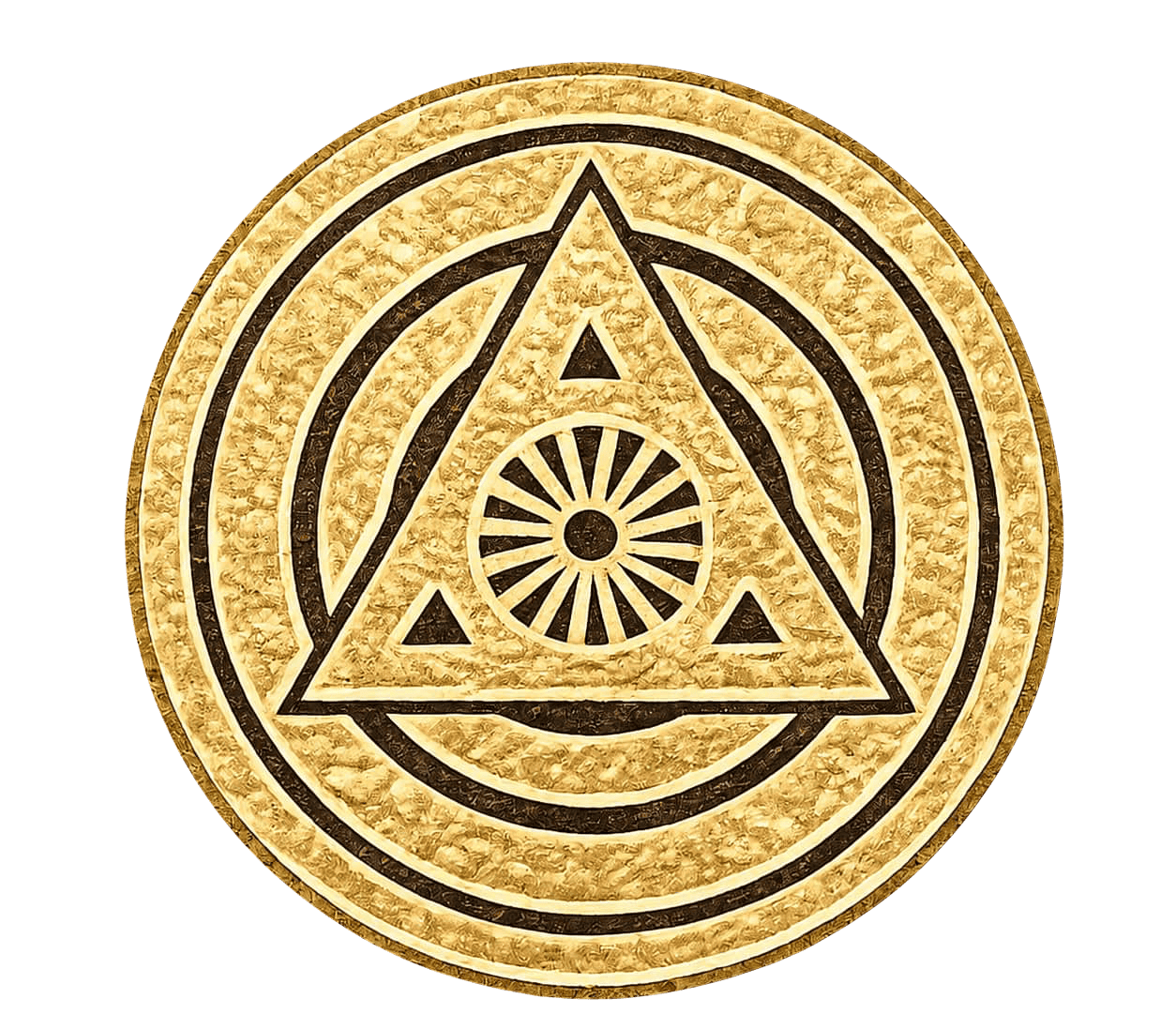
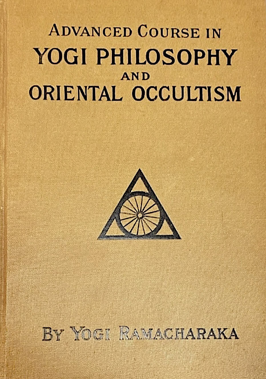
The Yogi Publication Society’s geometric emblem has become one of the most recognizable publishers’ marks in American esoteric literature. Although the Society later expanded the design, the original logo remained the foundational centerpiece upon which the later version was built. The original logo, used on its publications until mid 1904, consisted of a single central point from which sixteen equally spaced lines radiated outward to form a wheel enclosed within a circle. That circle was then inscribed within an equilateral triangle, creating their initial publisher’s mark.

The Philosophy Behind the Symbol
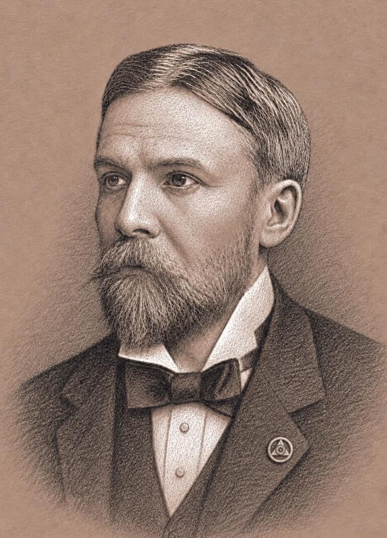
Before analyzing the sacred geometry meaning of the symbol, it is necessary to understand the philosophy from which it emerged. The Yogi Publication Society was founded in 1903 within the offices and network of Dr. Herbert A. Parkyn. By then, Parkyn had spent nearly a decade developing what became the most influential systems of Suggestion in America. His work rested on the principle that the mind, through thought, can direct natural forces to create health, happiness, and success.
Parkyn taught that the human mind operated through two distinct but inseparable modes of activity. The Voluntary Mind was the center of conscious thought, judgment, and will-power. Its function was to choose, direct, and impress ideas upon the subconscious Involuntary Mind which governed the body’s automatic functions like memory, emotion, and characteristic habits. The Involuntary Mind possessed enormous natural power, but without conscious direction, that power remained largely automatic, responding to repeated habit and environment.
Through the Laws of Suggestion, Parkyn sought to establish a proper relationship between the two aspects of the mind, where a clear disciplined intention impressed upon the involuntary mind by the voluntary mind would gradually reshape health, character, conduct, and circumstance. Parkyn regarded this as a universal law operating continuously, whether one understood it or not, expressing the principle in his often-repeated statement, “Thought Takes Form in Action.”
Parkyn’s research into this universal law extended beyond Western psychology. Throughout the late 1890s, he increasingly explored older religious, philosophical, and esoteric traditions, certain that they described the same underlying principles. To Parkyn, Eastern philosophy, Western esotericism, and modern psychology were not separate fields of study but different ways of expressing the same relationship between the laws of nature, the mind, and human potential.
The Yogi Publication Society was founded within this philosophical environment. William Walker Atkinson and others in the YPS network spent years studying under Parkyn at his Chicago School of Psychology, and the YPS titles reflect their shared search for common principles across various traditions. This same intention and purpose would be reflected in the sacred geometry of the YPS logo.
Related article: The Yogi Publication Society started in the offices of Herbert A. Parkyn
Related article: Herbert A. Parkyn’s Foundation in Eastern Philosophy
Related Article: From Mental Breakdown to Atkinsonia
A Shared Sacred Geometry Language
Across Hermeticism, Rosicrucianism, Hinduism, Freemasonry, Theosophy, and related traditions, sacred geometry has long served as a visual language through which foundational creative principles are truly expressed. In this visual language, the circle enclosed within an equilateral triangle is one of the most widely used forms, as it conveys the initial creative process in which intentional, conscious thought directs the infinite potential of creative power.
In sacred geometry philosophy, everything starts from a “point,” which is described as “THE ALL” and “ALL” and is visualized as “THE ALL WITHIN ALL AND ALL WITHIN THE ALL.” From this “point,” rays radiate outward across the reflected duality of the “point,” which is an infinite sea of potential (spirit), where they reach towards its unbounded circumference, having neither beginning nor end. This is visualized by the Ouroboros, the serpent consuming its own tail, symbolizing the eternal cycle of birth, death, and rebirth, where one is the beginning of another.

As the radiating rays move towards this unbounded circumference, they reach the “limit” of infinite consciousness and are then reflected back towards unity, giving rise to the archetypal forms of sacred geometry. The equilateral triangle, being the parent of the forms, establishes the first boundary within the infinite sea of potential, directing and focusing the reflected creative forces within its inscribed boundary. It is seen as the will and law of conscious thought. Its three equal sides are the first tangible geometric expression of perfect order, while its three points are the reconciliation of duality. Beginning from its two equally opposing points at the base, the equilateral triangle rises to a single apex, where these magnetized opposing forces are brought together in the union of polarity.
For Parkyn, the connection between the psychological Laws of Suggestion and the sacred geometric pattern of creation was expressed in the Hermetic maxim “As Above, So Below.” Whereby the involuntary mind is the circle, the infinite potential of creative power, and the equilateral triangle is the voluntary mind using intentional thought to impose direction, purpose, and order upon those infinite forces. “Thought taking form in action.”
The Sixteen Rays or Kalas
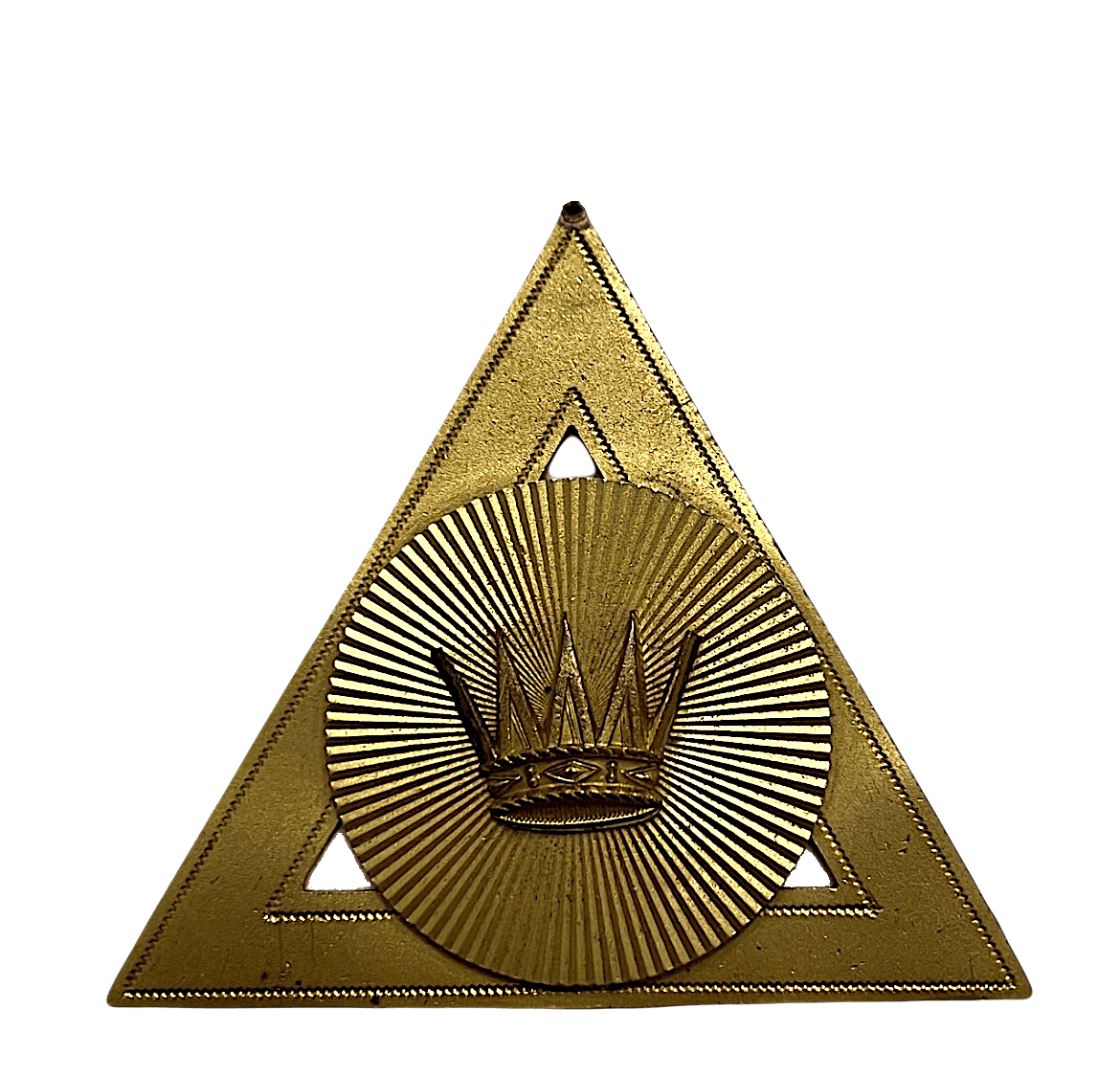
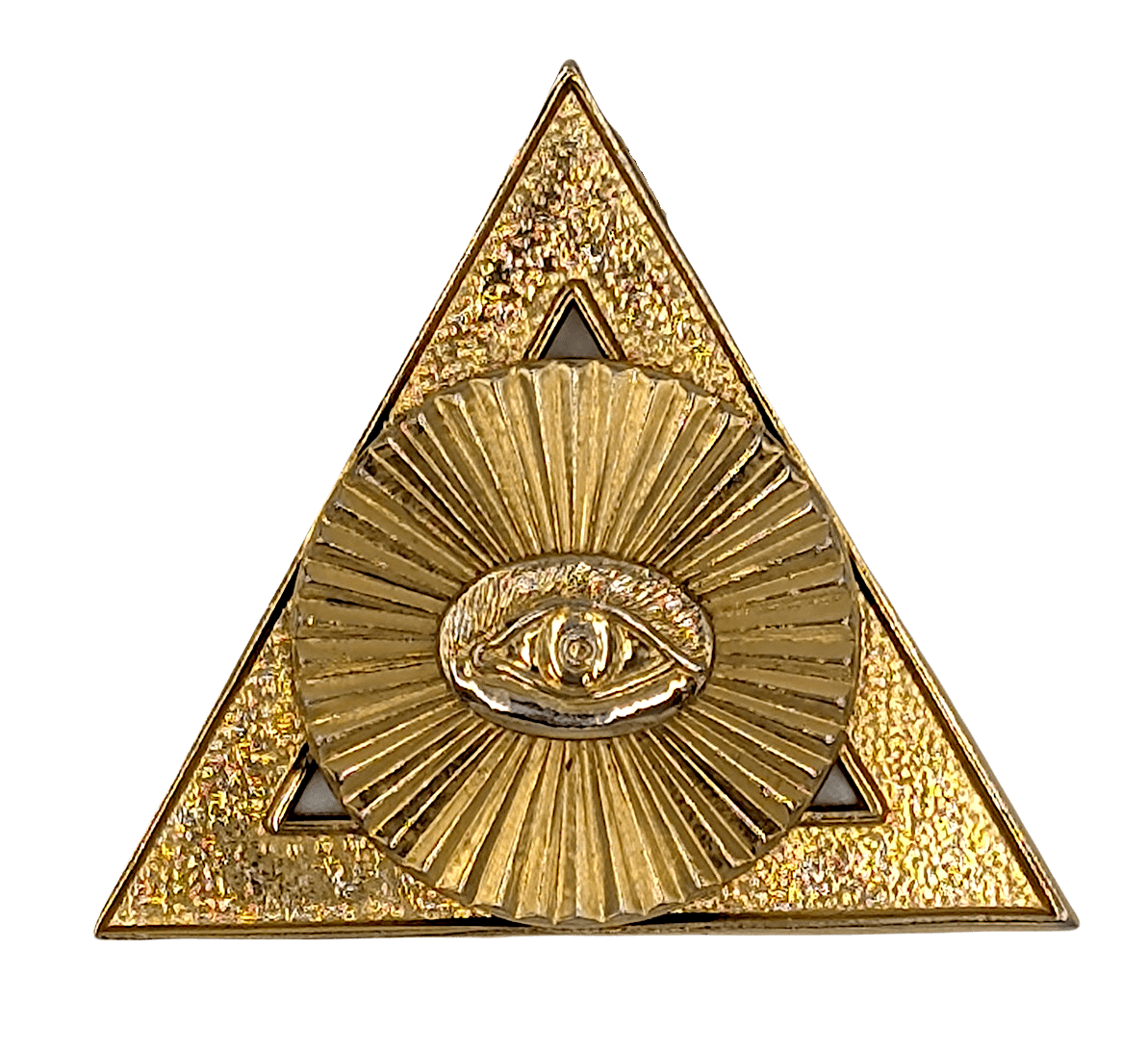
In Masonic traditions, the geometric creation pattern of a circle inscribed within an equilateral triangle was frequently used as the foundation for ceremonial jewels and emblems. With the esoteric understanding that the equilateral triangle represents intentional thought directing creative potential, a symbol placed within its bounded inner circle would direct the jewel’s intention. In Royal Arch Masonry, they placed symbols such as the All-Seeing Eye, the Triple Tau, a crown, a scroll, a key, crossed swords, and other symbols associated with particular offices or degrees. Each represented a distinct principle, duty, or virtue. Enclosed within the equilateral triangle, the central symbol became the focus of the jewel, expressing the purpose, authority, or work that was intended to be accomplished.
Following this same philosophy, the Yogi Publication Society chose to place sixteen rays radiating from a central point as its expressed purpose. This decision reveals their specific intention, as the teaching of the sixteen rays is central to Hindu philosophy, particularly in the Upanishads. There, it represents the complete manifestation of conscious rays through which the “One” experiences the world. The clearest expression of this idea appears in the Prashna Upanishad, where the sage Pippalada describes the Supreme Being, or Purusha, as the source from which sixteen kalās, (parts, powers, or emanations) proceed from the Bindu. These sixteen manifestations give rise to the universe and to every aspect of individual existence, with each kalā representing a specific facet of cosmic light, divine energy, or human consciousness. At death, they return once again to their source, just as rivers lose their separate names and forms when they enter the ocean.
This idea also appears in the Śvetāśvatara Upanishad, which describes the universe as the Brahma Chakra or the Wheel of Brahman. At its unmoving center stands the eternal Self, while the turning wheel represents the manifested universe governed by universal law. This imagery of a wheel radiating outward from a fixed center is the exact geometric structure at the center of the YPS emblem.
This teaching was well known within the Yogi Publication Society as they had published this very passage in The Spirit of the Upanishads by Yogi Ramacharaka:
“These rivers flowing to and gaining the ocean lose themselves in it… So do all the sixteen forms of the objective, flowing to and gaining the Self, become lost in Him… Know the only knowable, the Self, in whom are centered all forms like the radii of a chariot-wheel in its hub.”
The Upanishad describes the sixteen kalās as the radii of a wheel converging at a single center, which aligns with the design at the center of the YPS logo and shows that the idea of the sixteen kalās is at the heart of the logo.
By placing the sixteen-spoked wheel at the center of its emblem, YPS declared its intention to bring forward the truths of Hindu philosophy. Just as Royal Arch Masonic emblems placed a symbolic object at their center to signify the work they were intended to accomplish, the YPS chose the sixteen kalās of the Upanishads to signify its mission to reveal and manifest the wisdom of the East.
Parkyn’s Astra pseudonym for Yogi and Occult philosophy
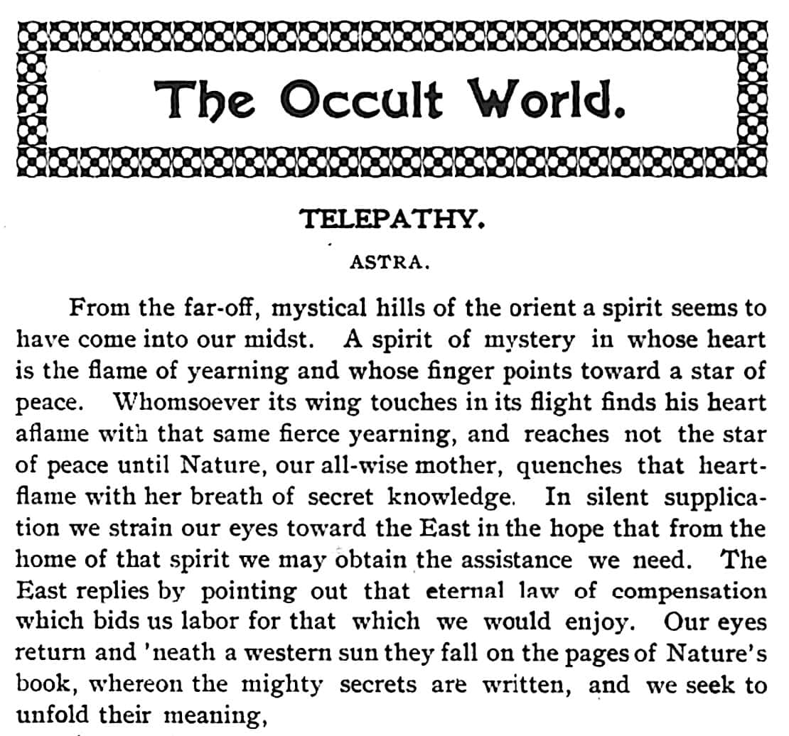
This intention was not new for Parkyn. Five years before the founding of the Yogi Publication Society, he expressed the same aspiration in his Occult World column, published in the first issue of Suggestion magazine in 1898. Writing under the pseudonym of “Astra,” he introduced the new column with this invocation,
“From the far-off, mystical hills of the Orient a spirit seems to have come into our midst… In silent supplication we strain our eyes towards the East in the hope that from the home of that spirit we may obtain the assistance we need… the East replies by pointing out that eternal law of compensation… our eyes return and neath a Western Sun fall on the pages of nature’s book, whereon the mighty secrets are written, and we seek to unfold their meaning.”
The YPS logo can be understood as a visual continuation of that same intention: to gain a deeper understanding by seeing the connection between the Yogic philosophical teachings of the East and the New Psychology and ancient esotericism of the West, and to make those truths unfold. Parkyn’s invocation calls to the East for assistance in understanding the mysteries of the mind and psychic phenomena, whereas the East replies that it exists in the same Western laws of nature that follow the eternal law of compensation. The YPS logo thus combines the inner circle of the sixteen Kalas, representing the inner teachings of the East, with the Western Hermetic teachings of the triangle and outer circle of sacred geometry into a unified teaching.
Read the article: Astra: Herbert A. Parkyn’s First Yogi Pseudonym and the Foundation for the Yogi Publication Society
The Evolution of the Symbol
In mid-1904, the Yogi Publication Society expanded its logo by adding two outer concentric circles, transforming the original emblem into a more elaborate geometric composition while leaving its central elements completely unchanged. The addition of these circles revealed that the original triangle was actually two nested triangles, with each of the new circles enclosing an inner triangle and an outer triangle. In sacred geometry, nesting these shapes expresses the unfolding of creation: from unity, into duality, and finally into the ordered reconciliation of polarity through the trinity.
Royal Arch Masonry
The addition of the two concentric outer circles closely follows the symbolic progression found in Royal Arch Masonry. There, an officer’s jewel begins as a simple triangle enclosing a central symbol, and as the individual advances in knowledge and service, two concentric circles are added around the triangle.


In Royal Arch Masonry, the new inner circle symbolizes the Deity, while the outermost circle represents infinite potential. Together they signify that the initiate has progressed beyond the structured instruction contained within the triangle and is now prepared to apply that knowledge to a deepening understanding of the Divine and the infinite universe. This suggests that the expanded YPS logo in 1904 signaled that its introductory courses in Yogi Philosophy and its first generation of students were progressing toward higher understanding and deeper knowledge.
The expanded YPS logo also resembled the classic geometric compositions associated with Hermetic and Rosicrucian symbolic imagery.
John Yarker’s Illustration from The Kneph
One of the most striking comparisons to the Yogi Publication Society logo appears in The Kneph, the official journal of John Yarker‘s Ancient and Primitive Rite of Masonry, published in England from 1881 to 1900. Yarker (1833–1913) was one of the leading Masonic scholars and esoteric writers of the nineteenth century. Through The Kneph, he sought to move beyond the strictly Christian interpretation of Freemasonry and recover what he believed was a universal wisdom tradition shared by the ancient religions of the world.
The Kneph freely explored Hermetic philosophy, Rosicrucianism, Gnosticism, Qabalah, comparative religion, and Eastern philosophy. Yarker argued that beneath these different traditions lay the same fundamental spiritual principles. His journal became an early meeting place between Western esotericism and Eastern thought, anticipating many of the same ideas that would later be promoted by the Theosophical Society and by the Yogi Publication Society.
One of Yarker’s best-known 1890s illustrations is built upon the same geometric structure as the YPS logo. It consists of a central emblem enclosed within an equilateral triangle, and framed by the ancient serpent of eternity. Yarker also incorporated sixteen radiating rays extending from the solar disk, arranged in a pattern that closely corresponds to the sixteen-spoked wheel adopted by the Yogi Publication Society.
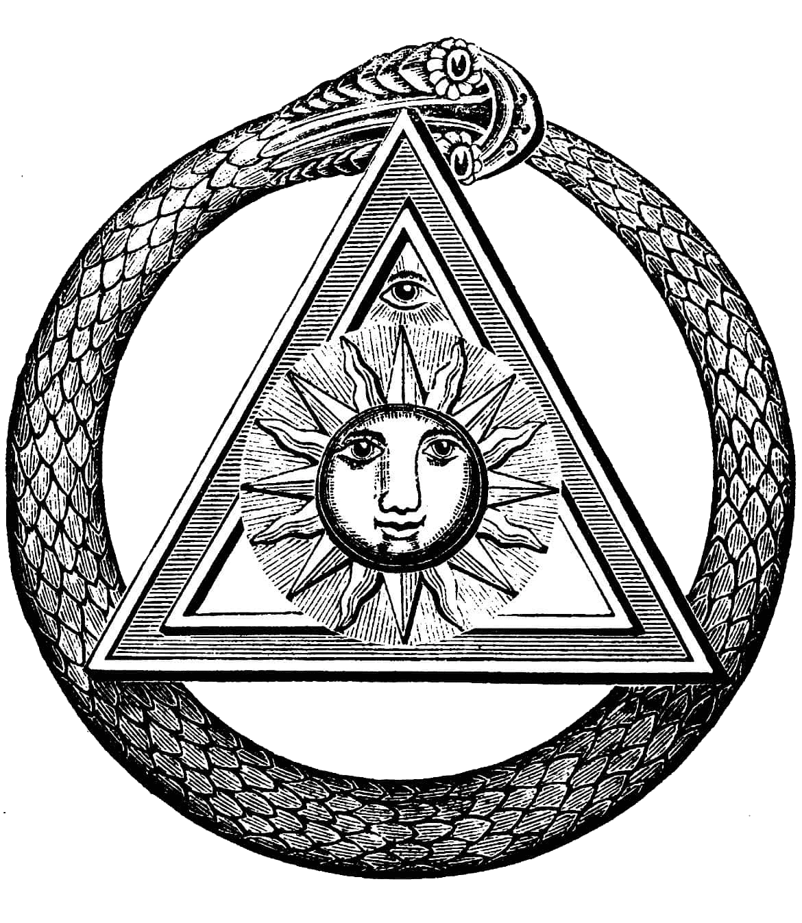
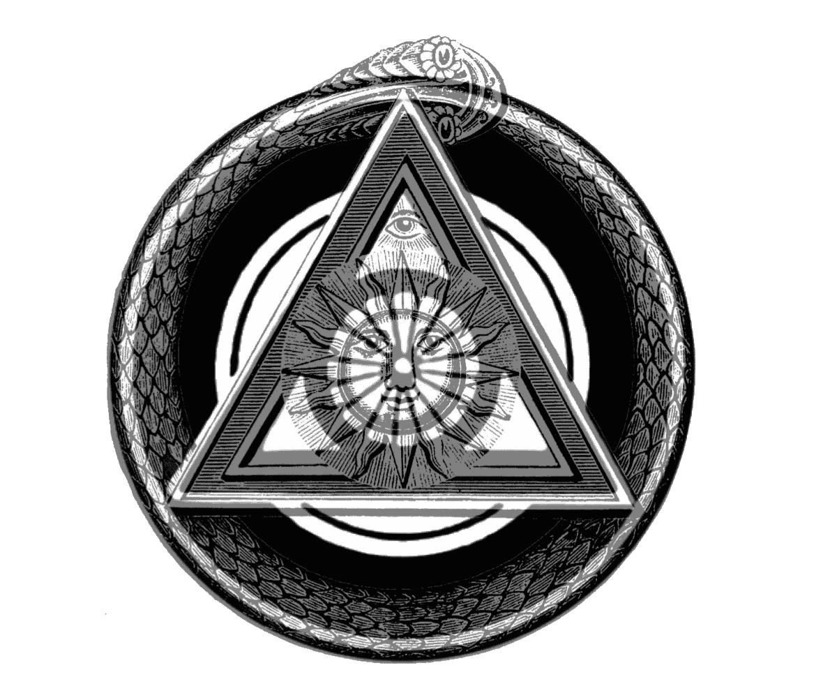
When the two emblems are superimposed, the similarities become unmistakable. The triangles coincide, the outer circle occupies the identical position, and the sixteen rays of Yarker’s solar emblem align remarkably close with the sixteen rays of the YPS wheel. The comparison suggests that both images were constructed according to a common symbolic purpose.
The similarities become even more significant when seen alongside Yarker’s lifelong interest in Eastern philosophy. He was a strong supporter of the early Theosophical Society and corresponded extensively with Helena Petrovna Blavatsky on the relationship between Masonic symbolism and Eastern religious thought. His Masonic systems incorporated Hindu and Egyptian concepts, and The Kneph regularly published articles examining the Vedas, the Upanishads, yogic breathing, and the philosophical traditions of India to demonstrate the existence of a single ancient wisdom tradition.
Finding the almost identical sacred geometry employed to express related philosophical ideas in both Yarker’s emblem and the YPS logo suggests a strong connection to Masonic and Theosophical influences in the Yogi Publication Society’s intentions.
The Philosopher’s Stone Emblem by Michael Maier
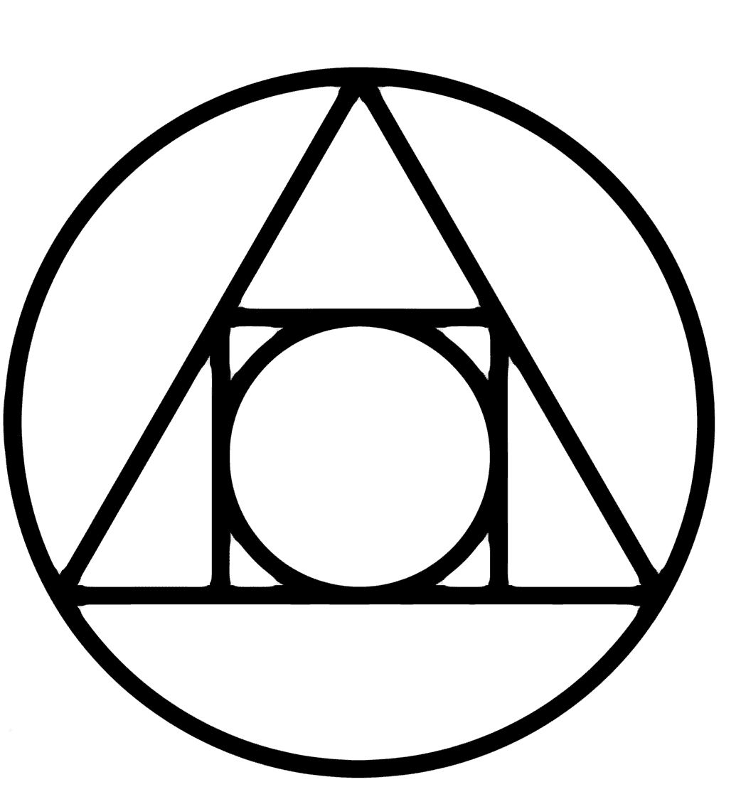
One of the earliest examples is found in the work of the seventeenth-century alchemist and Rosicrucian, Michael Maier. In his 1617 emblem book, Atalanta Fugiens, Maier illustrated the process of spiritual transformation through a carefully constructed geometric form in which a central circle is enclosed by a triangle, which is itself enclosed by an outer circle. He further surrounded the central circle with a square representing the four classical elements, earth, air, fire, and water, with the central circle representing the fifth element, Quintessence. This geometric arrangement became one of the classic visual expressions of the Philosopher’s Stone and the alchemical process of “Squaring the Circle.”
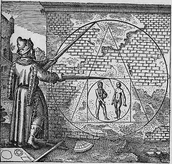
Both Maier’s emblem and the YPS logo employ the same sacred geometry symbolism to describe the movement from unity toward manifestation and the ordering of creative power through universal law. Hindu philosophy contains a parallel in the Cintamani, the legendary wish-fulfilling jewel representing the realization of spiritual perfection.
Fraternitas Rosae Crucis and The Winged Globe Emblem
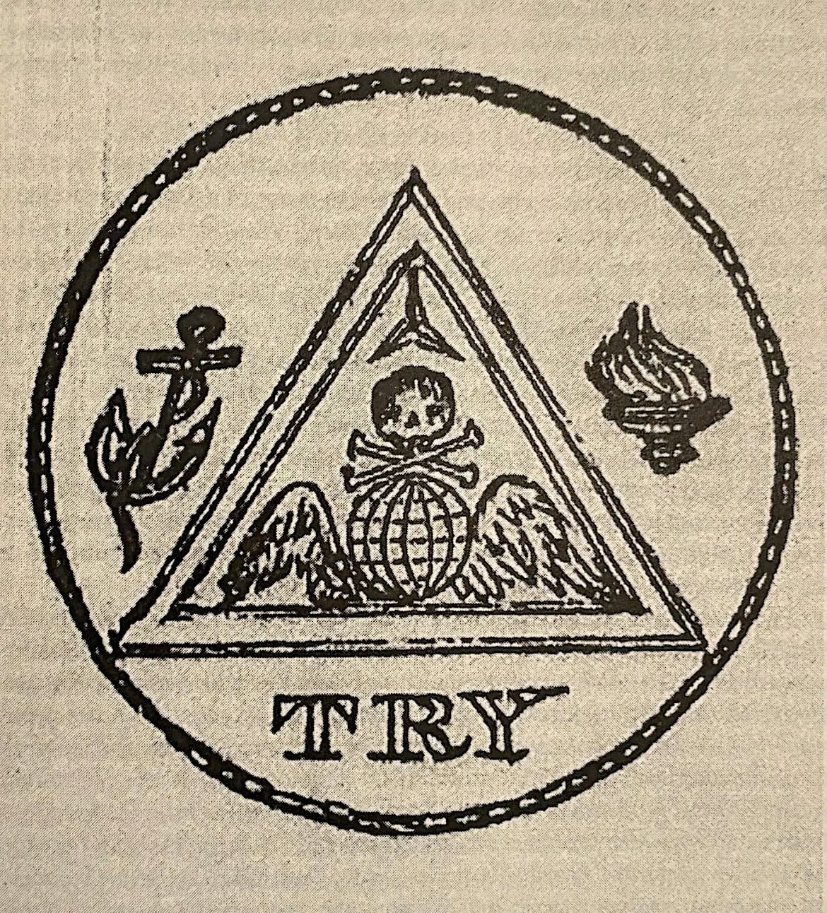
Another parallel appears with the emblem of the Fraternitas Rosae Crucis a Rosicrucian fraternal organization established in the United States by Paschal Beverly Randolph in 1856, From 1922 to 1966 it was lead by R. Swinburne Clymer, an early graduate of Herbert A. Parkyn’s Chicago School of Psychology. Like the YPS logo, the Fraternitas Rosae Crucis emblem is built upon the same progression surrounding a central symbol. Randolph placed a winged globe at the center of the design. In his philosophy, the winged globe represented the soul emerging from the Divine Mind and progressing toward spiritual illumination. Beneath the emblem appears Randolph’s personal motto, “TRY.” Randolph described this principle through his concept of Volantia, the calm, steady, and deliberate exercise of the human will
The Yogi Publication Society’s Winged Emblem
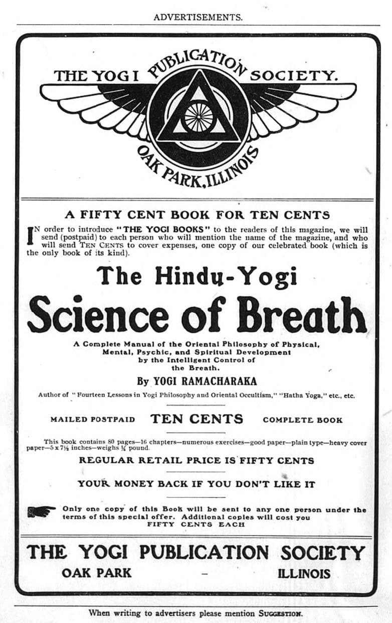
In August 1904, Herbert A. Parkyn‘s Suggestion magazine heavily promoted the Yogi Publication Society’s new release, The Hindu-Yogi Science of Breath, and the Society’s move into larger quarters in Oak Park. The issue featured three articles on breathing and Yogic philosophy, as well as a full-page advertisement for the book.
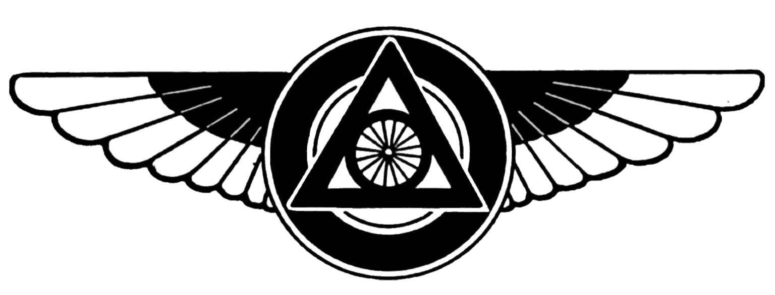
The advertisement marked the first appearance of the redesigned YPS logo. This was the public debut of the new emblem, introducing the expanded concentric circles that would become the Society’s permanent mark. But the logo didn’t make its first appearance in the form that we know today. Instead, it debuted with a pair of wings that emphasized the progression the Society was making.
The Winged Globe
The winged globe was one of the oldest and most recognizable symbols in the Hermetic, Rosicrucian, and Masonic traditions. Originating in ancient Egypt as the winged sun disk, it represented divine authority, cosmic protection, and the eternal order of creation. As the symbol passed into the Hermetic tradition, the wings came to represent the ascent of the soul through knowledge. They symbolized wisdom in motion, the transmission of divine truth, and the ability to carry sacred knowledge from one world to another. Attached to a geometric emblem, the wings transformed a static symbol into one of movement, growth, and spiritual progress.

The addition of the wings also reflected a new stage in the development of the Yogi Publication Society. The Hindu-Yogi Science of Breath was the Society’s first standalone book devoted to a single subject rather than forming part of its original fourteen-lesson course in Yogi Philosophy. It marked the beginning of the Society’s transformation from a correspondence school into a dedicated publisher. At the same time, the Society was moving into larger headquarters in Oak Park. So the added wings seem to have been a symbol of the YPS now taking flight.
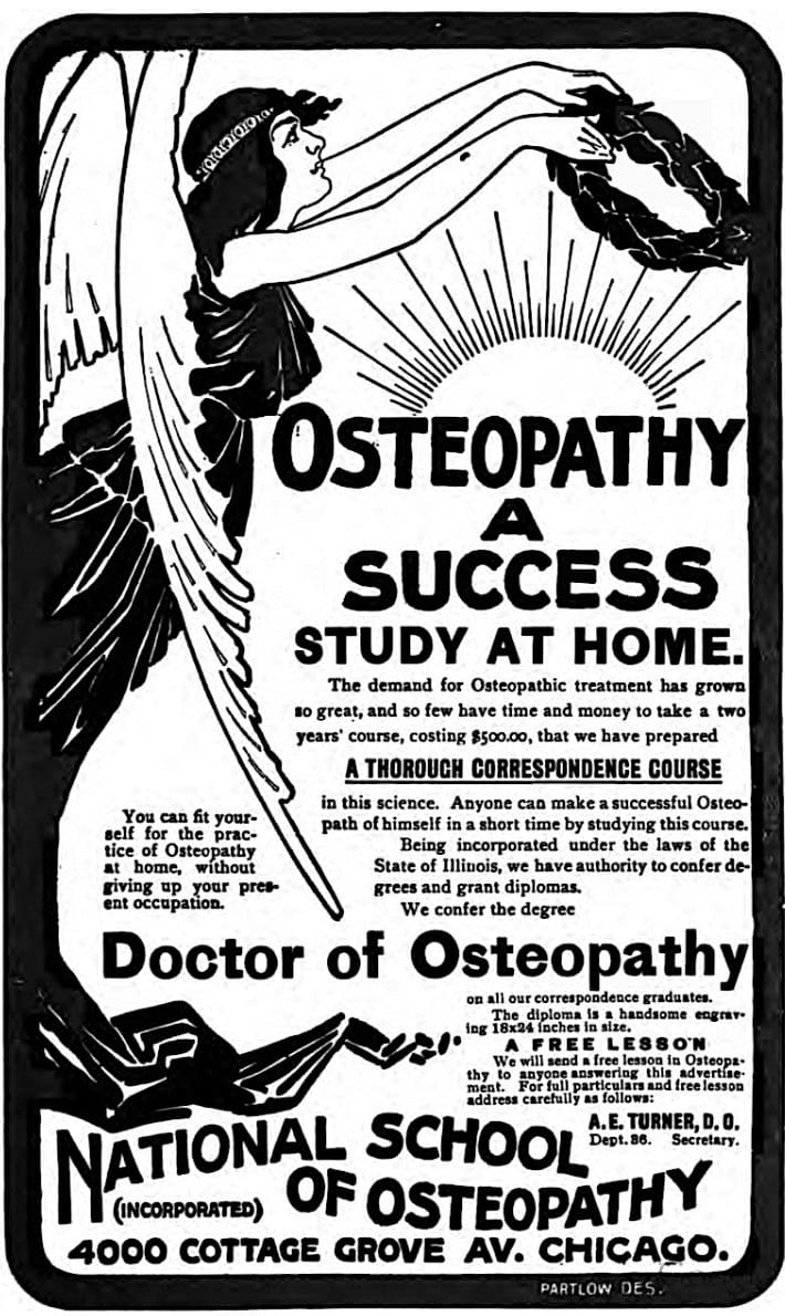
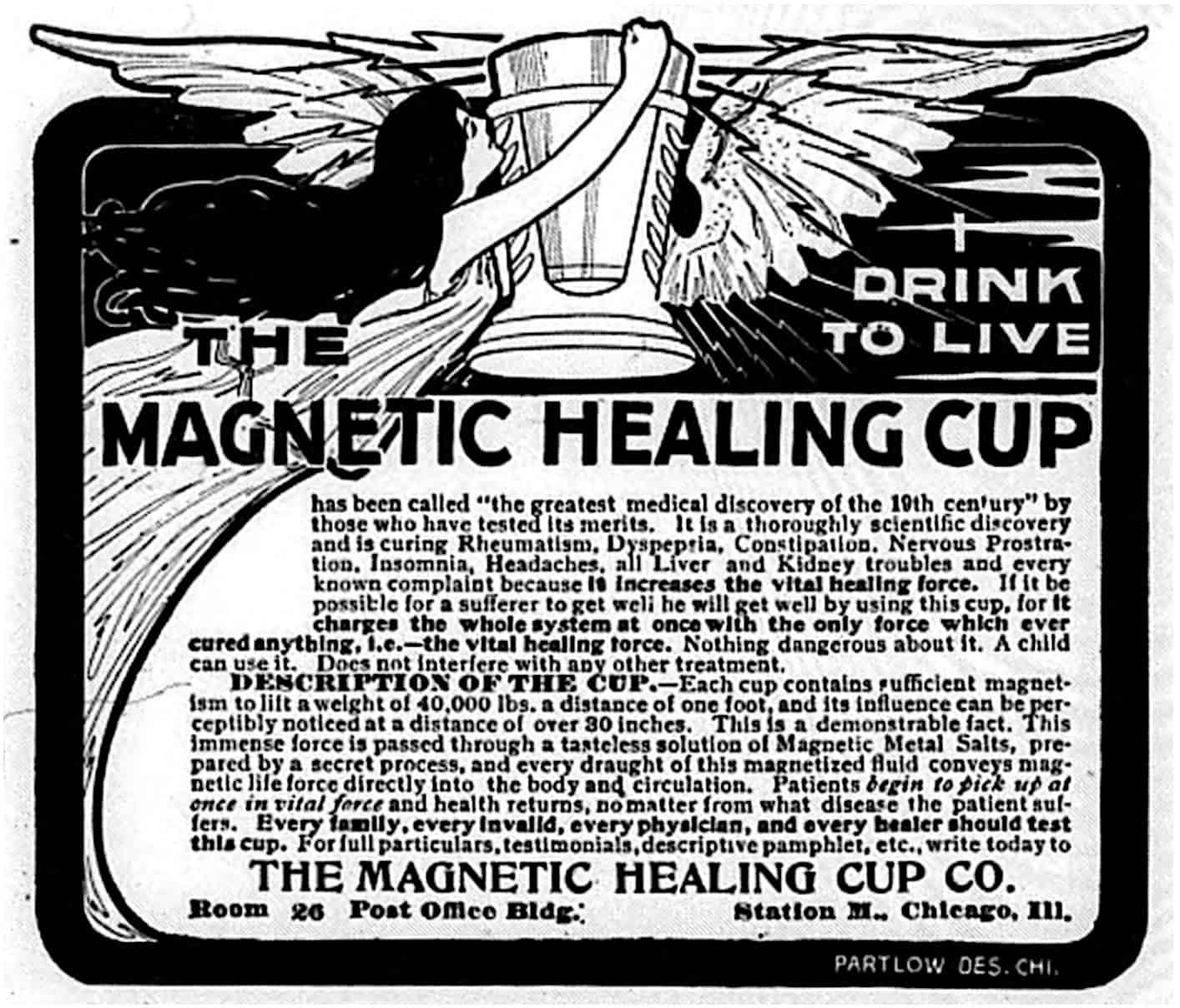
Parkyn had used the Winged Globe imagery in his advertising for several years. He had commissioned Partlow Designs of Chicago to create advertisements for both his Magnetic Healing Cup and the National School of Osteopathy, which were both also headquartered at 4000 Cottage Grove Avenue, with the Yogi Publication Society. From the similarity in the integration of typography and illustration with the repeated use of winged imagery, it was Partlow Designs that translated the Society’s concept into the finished artwork used in print.
A Universal Language
The Yogi Publication Society logo was constructed using the universal and ancient language of sacred geometry preserved through the Rosicrucian, Hermetic, and Masonic traditions. The historical connections support this conclusion. For years, Herbert A. Parkyn was closely associated with the intellectual circles that shaped the movement the Yogi Publication Society would later advance, including the Theosophical Society, the Rosicrucian Order of the White Rose, the Fraternitas Rosae Crucis, the Knights Templar, and the philosophy underlying the Law of Suggestion. Rather than existing as separate movements, these organizations formed an interconnected network dedicated to exploring what they believed were the universal principles underlying the world’s religious and philosophical traditions.
Three, Six, Nine (3, 6, 9)
The YPS logo is the sacred geometric pattern of the initial unfolding of creation. Beginning at the “point,” the thought of unity from which all creation proceeds, rays extend outward before being enclosed within the infinite and boundless circle of duality. Together, the “point,” the “straight line,” and the “curved line,” form the first trinity of creation, known as “The Three Initiates.” (3)
This initial principle is repeated as creation unfolds. The straight lines of the rays form the three sides of the triangle, which is then bounded by the second circle. Together with the center point, this is the second trinity. (6)
The pattern repeats once again with the last triangle and circle to complete the “trinity of trinities.” (9) This is also known as “33” as in the age of Jesus at crucifixion and the 33 degrees of Masonry.
Throughout the progression of creation, the “point” remains at the center of every stage while also existing within every line and every curve, for all geometric form is composed of points. Unity is forever present throughout the entire process of manifestation and is symbolized by a final concentric circle that bounds the entire form. “As above, so below“